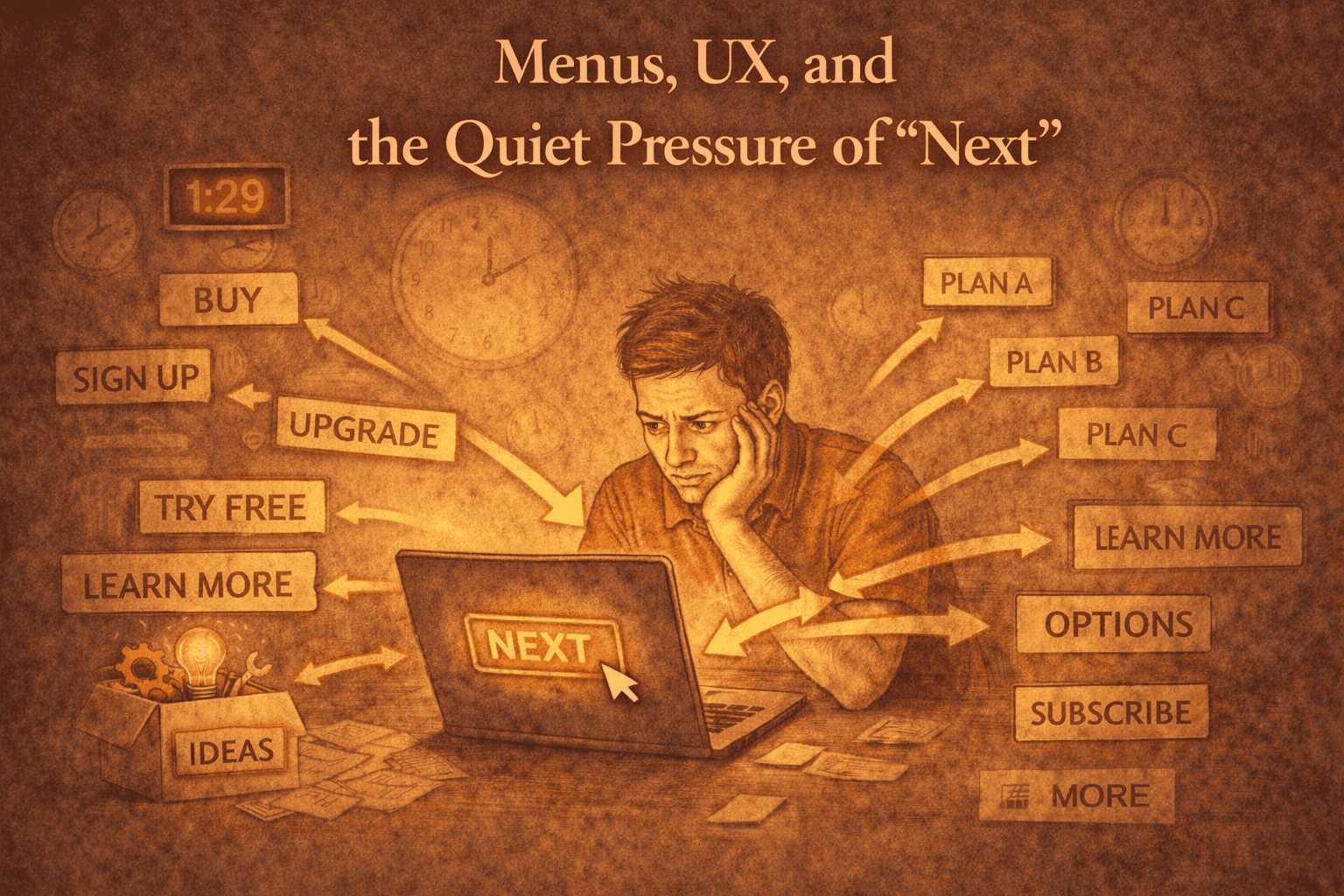
Interfaces tell people what to do, even when they pretend not to.
- A menu item called “Start Here” creates pressure.
- A progress indicator implies obligation.
- A dashboard suggests ongoing engagement.
None of that is neutral.
I’ve become increasingly attentive to the quiet instructions embedded in UX. Most of them are unintentional, inherited from patterns designed for retention rather than resolution.
When I design interfaces now, I ask a different question: does this allow someone to stop without feeling incomplete?
Flat navigation, neutral labels, and the absence of prompts all matter. They signal that the work does not require continuation to be valid.
Good UX doesn’t always guide. Sometimes it steps back.
Removing implied “next steps” doesn’t make work harder to use. It makes it easier to accept.