This narrative grows out of the questions described in Why Info Product Build Exists.
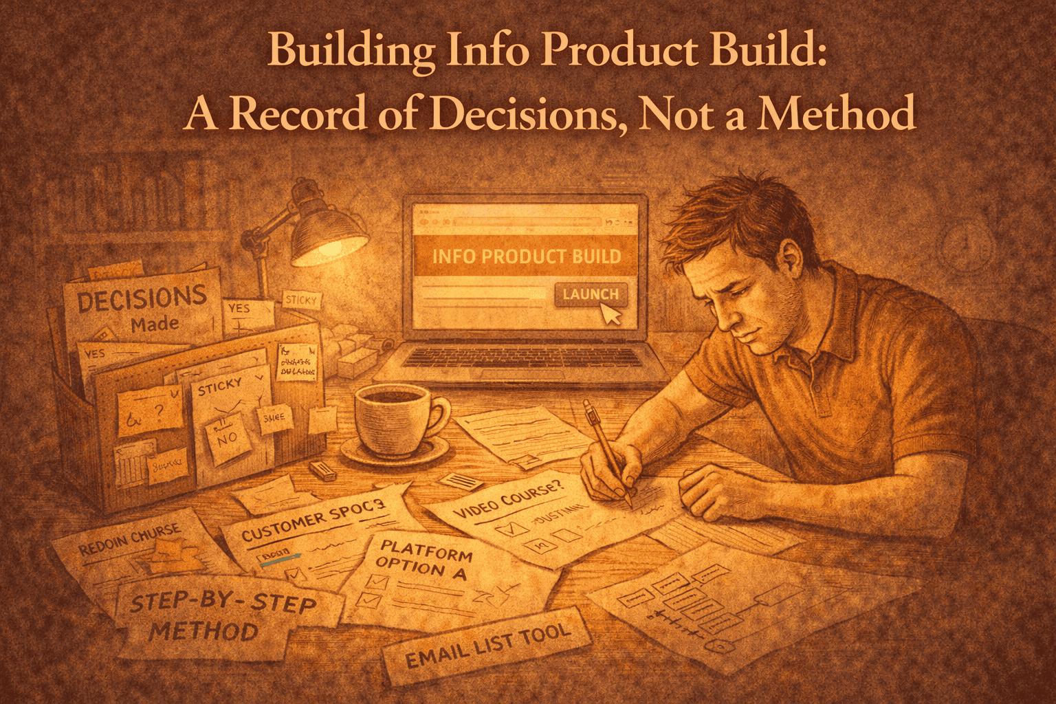
This is a record of how Info Product Build came into existence.
Not as a guide, not as a case study, and not as something to replicate — but as a way of documenting how a series of decisions were made, challenged, and eventually locked.
I’m writing this primarily so I can see, later, why this work took the shape it did. If it’s useful to others, that’s a side effect, not the goal.
There’s a lot to unpack here, and while writing this, there were various points where I wanted to expand on something, but it would have spoiled the flow of the post, so I simply wrote another post to give more context, included a link and then simply moved on.
Why This Was Built at All
Info Product Build (from here-after known as IPB) began with a recurring moment I kept recognising.
An idea would surface — something that could become an information product — but I wasn’t convinced that building it was the right thing to do. Not because I lacked confidence or capability, but because the cost of building felt real, and the justification often didn’t.
Most advice assumes that having an idea is already halfway to action. The default response is to refine it, package it, and move forward. I kept finding myself stuck before that point, asking a more basic question:
Should this be built at all?
That question didn’t seem to have a home.
Existing resources tended to answer how to build, not whether building was warranted — a dynamic I’ve written about in why I stopped turning everything into a how-to.
Over time it became clear that this gap — the space before commitment — was where the real tension lived.
That was the moment IPB earned the right to exist.
This was also about the same time that I stopped defaulting to how-to content
The First Refusal: Not Building by Default
One of the earliest decisions was also one of the hardest to sit with: most ideas should not be built.
This wasn’t a motivational stance. It was a practical one.
Every build creates obligation:
- to maintain
- to explain
- to defend
- to update.
Treating building as the default choice ignores that cost.
I wanted IPB to legitimise the opposite outcome:
- stopping early
- with clarity
- and without regret.
That decision reshaped everything else.
If not building was a valid outcome, then IPB couldn’t be a motivator, a framework, or a system — a distinction I expand on in finished is a design choice, not a phase.
It had to be something that helped someone accept a decision, not push them past it.
Choosing Judgment Over Instruction
At multiple points, IPB wanted to become instructional.
There were obvious places where I could have shown how to get something live, how to choose tools, or how to structure delivery.
Each time, the same problem surfaced: instruction creates dependency — not just for the reader but for me as the creator.
The moment you explain how to do something, you implicitly agree to stand behind that explanation — a pattern I explored in why I stopped turning everything into a how-to
You invite edge cases, updates, and follow-on questions. The work no longer ends cleanly.
IPB was designed to do the opposite.
Its job was to replace agitation with judgment — not to escort someone into execution.
This meant refusing to show steps, even when they felt helpful. Especially when they felt helpful.
Creating the Outline by Deciding What Was Excluded
The structure of IPB didn’t emerge by adding sections. It emerged by excluding them.
Early on, I considered reference layers, implementation notes, and supplementary material.
Each addition made the work feel more accommodating — and less finished.
The outline eventually settled into Parts I–V, followed by a Terminal Page.
That shape mattered.
It allowed the work to progress conceptually while still pointing toward an ending.
Examples were included, but quarantined. They were framed as evidence, not models. Anything that suggested repetition, optimisation, or extension was deliberately left out.
The question guiding the outline wasn’t “what should be included?” but “what would prevent this from ending?”
Writing Piece by Piece, and Locking Decisions as We Went
The writing process itself followed the same philosophy.
I worked in discrete pieces and locked decisions as they were made. Once a section was finished and aligned, it wasn’t reopened. Drift was treated as non-consent.
This reduced a surprising amount of pressure. Instead of endlessly revisiting earlier choices, I could move forward knowing that the shape of the work was stabilising.
Locking decisions wasn’t about rigidity. It was about protecting clarity — a pattern I discuss in finished is a design choice, not a phase.
The Question of Video — and Why It Was Rejected
One of the strongest internal tensions was the absence of video.
I’ve built video-based products before. Video carries weight: time investment, presence, reassurance. It also quietly inflates perceived value.
But that inflation comes at a cost.
- Video implies accompaniment.
- It suggests progression.
- It makes the work feel ongoing.
IPB didn’t need that. In fact, video would have undermined it.
Choosing text-only wasn’t a compromise. It was an alignment decision — similar in spirit to why I don’t add FAQs anymore.
Text allows finality.
It can be read once, twice, or not at all, without implying obligation.
The discomfort I felt around pricing without video turned out to be useful. It forced me to confront what the work actually was — and what it wasn’t.
Resisting the Urge to Add “Just One More Thing”
Late-stage pressure is real.
By the time most of the work was complete, there were still temptations to add more: an FAQ, a reference layer, additional clarifications.
Each one sounded reasonable in isolation.
Taken together, they would have reopened the work.
The decision not to add an FAQ was especially instructive — see why I don’t add FAQs anymore for the thinking behind that.
FAQs expand scope sideways. They legitimise uncertainty and invite ongoing explanation. In this case, leaving questions unanswered was more honest.
Distribution as Design
How IPB was distributed mattered as much as what it contained.
- Affiliate language was constrained deliberately — a perspective I explore in affiliates are not neutral.
- Marketplaces were treated as neutral distribution, not sources of legitimacy — a stance I explain further in why I don’t optimise for the marketplace.
- A new product ID was chosen to avoid inheriting expectations from past work.
- Menus were designed to avoid implied “next steps.” Labels were neutral. Navigation was flat.
None of this was marketing polish. It was design.
Closing the Surface Area
Before releasing IPB, I ran through a line-by-line checklist.
Not to catch mistakes, but to remove residual anxiety. Each item was confirmed or dismissed explicitly. Once the list was complete, the project stopped.
That act — deliberately closing the surface area — was as important as any individual decision along the way.
Finished is not a feeling. It’s a state you enter intentionally.
Aftermath
Once IPB was finished, something unexpected happened.
There was no urge to revisit it. No sense of “what if I just added…” The work felt independent — no longer something I needed to carry.
It was simply available — an idea I unpack in the difference between availability and a launch.
That, more than anything else, confirmed the choices that led here.
Final Note
This post isn’t an argument for building products this way.
It’s a record of how one asset was built by refusing to default to action, by treating restraint as design, and by allowing work to end.
In that way, this post joins others on SKO that document not just what I created, but the thinking behind why it was allowed to finish.