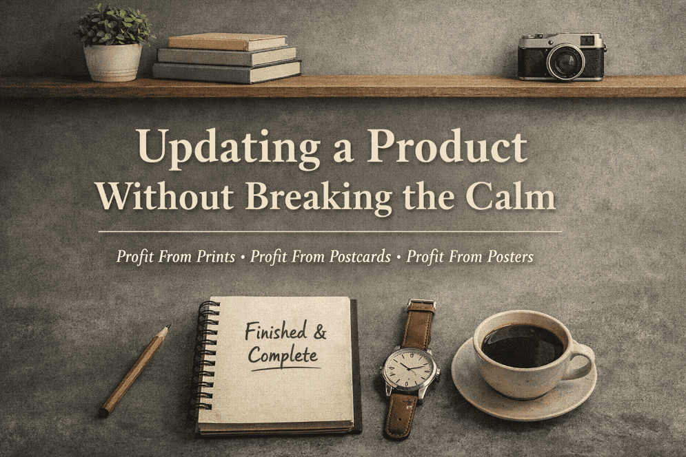
This post documents the process of updating and relaunching three existing digital products:
- Profit From Prints
- Profit From Postcards
- Profit From Posters
It follows on directly from A Long Day, a Finished Product, and a Hard Lesson About Calm, which captured the moment the work finally felt finished.
This post explains how that happened, not in terms of tactics or launches, but in terms of decisions, restraint, and completion.
This Wasn’t Ideation — It Was Closure
The work here wasn’t about creating something new.
The products already existed.
The content already existed.
The experience already existed.
What didn’t exist was:
- a clean structure
- clear boundaries
- or a sense that the work was finished
This wasn’t a creative project. It was an implementation and cleanup project.
Those are harder to do well, because they require saying no far more often than saying yes.
Framing Was the First Decision
The most important decision came early:
These products would be positioned as reference libraries, not courses.
That decision wasn’t aesthetic. It reduced long-term cost. Reference libraries don’t require constant updates, cohort support, or ongoing expansion. That lowers time pressure and protects margin.
That single choice set everything else in motion.
It meant:
- no outcomes or guarantees
- no instructional pressure
- no urgency or launch mechanics
- no bonuses, upsells, or ladders
- no obligation to keep adding content
Scope creep doesn’t just add content, it adds cost and pressure. Keeping scope contained also keeps fixed costs contained.
Each product would be a thinking record, opinionated, finite, and complete.
Once that was locked, many other decisions became obvious.
WordPress as a Delivery Layer, Not a Platform
The next decision was about infrastructure.
WordPress was used deliberately, not as a publishing platform, but as a content and delivery layer. This structure keeps fixed costs low and avoids being locked into a £200/month platform before revenue justifies it.
Wishlist Member was added only for:
- access control
- membership gating
Not for:
- engagement
- drip logic
- or behavioural systems
There is:
- one core library membership
- separate access paths for individual artifacts
- and a single post-login destination
No welcome pages.
No “next steps”.
No funnels.
Fewer moving parts mean fewer recurring tools and less monthly overhead.
After purchase, users are taken directly to the Member Dashboard.
The goal was immediate orientation, not momentum.
Navigation Was Designed to Remove Pressure
Navigation was intentionally minimal.
Public users see:
- Home
- Get Access
Members see:
- Library
Nothing else competes for attention.
There’s no duplication between public and private navigation, and no attempt to “guide” users through content.
This wasn’t accidental, it was a conscious choice to let people orient themselves.
The Core Work: Archived Video Libraries
The bulk of the work was in completing the archived video libraries:
- Profit From Prints – Archived Video Reference
- Profit From Postcards – Archived Video Reference
- Profit From Posters – Archived Video Reference
For each library:
- every historical video was uploaded
- videos were embedded sequentially on a single archive page
- Bunny.net was used for hosting
- no re-editing or modernisation was attempted
Instead, explicit framing text was written and locked:
- what these videos are
- what they are not
- how they should be used
- why they are not being updated
This reframed old material as context and continuity, not instruction.
That distinction mattered.
Visual Cleanup Was Not Cosmetic
A significant amount of time was spent on thumbnails.
This wasn’t branding polish, it was clarity work.
Legacy branding was removed.
New thumbnails were created for every video.
Care was taken with:
- text alignment
- padding
- mobile and embed safety
- consistent course-specific branding
Separate thumbnails were created for shared policy videos so they didn’t appear to “belong” to a single product.
The result is a library that looks intentional, not accumulated.
That visual coherence removes doubt before a single video is played.
Shared Policy Videos as Global Reference
Three policy videos were treated differently:
- Refunds
- Postage
- Returns
They were positioned as global reference material, not bonuses or course content.
They are accessible across multiple products, with neutral thumbnails and no course branding.
This avoided duplication and reinforced the idea that some material exists to support decisions, not to sell.
What Changed Emotionally (and Why That Matters)
The most noticeable outcome wasn’t growth.
It was stability.
Stability matters because it removes pressure to chase constant launches or updates simply to justify the product’s existence.
There are now:
- no loose ends
- no “to be updated” pressure
- no blurred boundary between past and present thinking
The products feel finished.
That matters because unfinished work creates ongoing cognitive load, even when it isn’t being actively worked on.
Completion restores trust, in the product, and in yourself as the person maintaining it.
Decisions Worth Noticing
Several decisions are worth highlighting, because they run counter to common advice:
- publishing before every artifact was ready
- choosing restraint over optimisation
- avoiding welcome flows and engagement tricks
- treating old material as a record, not something to fix
- investing time in clarity instead of new creation
None of these decisions improved growth metrics.
All of them improved stability.
What This Process Represents
Updating a product isn’t about adding more.
It’s about deciding:
- what stays
- what stops
- what is allowed to be finished
A closed project is easier to trust, for the creator and the buyer.
And once something is finished properly, it no longer demands attention.
That’s not a productivity win.
It’s an operational one.
Closing
This process didn’t create something new.
It created closure.
The products now exist as calm, stable assets, not obligations, not promises, and not works-in-progress.
That outcome wasn’t accidental.
It was the result of deliberate decisions, made slowly, and then locked.
This post documents the process of updating and completing existing digital products as reference assets. Any future changes to this approach will be recorded separately over time.